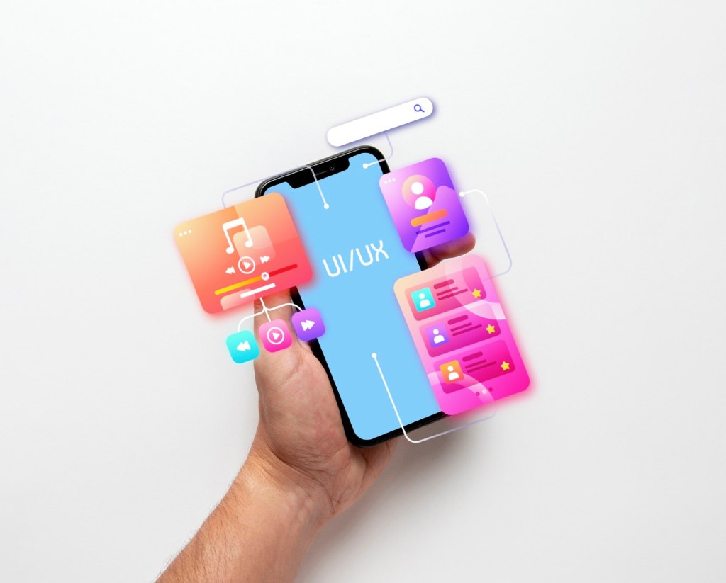
The right colors can grab attention, evoke emotions, and guide users effortlessly through a digital experience. In UX design, color influences everything from brand perception to usability, making it a critical element for businesses aiming to engage and

The Psychology of Color
Colors carry emotional weight. Blue often feels calm and trustworthy, which is why banks like to use it. Red can signal urgency or excitement, perfect for a “Buy Now” button on an e-commerce site. Green evokes growth or eco-friendliness, ideal for a sustainable brand. Understanding these associations helps designers align colors with a brand’s personality. For instance, a meditation app might use soft purples to promote relaxation, while a fitness app could opt for bold oranges to inspire energy. Knowing your audience’s cultural context is key, as color meanings can vary globally.
Enhancing Usability with Color
Color guides users through an interface. A bright button in a contrasting hue, like a yellow “Sign Up” on a dark background, draws the eye naturally. Consistent color coding—like blue for clickable links or gray for disabled options—helps users navigate intuitively. For example, a travel booking site might use green for confirmed bookings and red for errors, making the process clear at a glance. High contrast between text and background, such as black on white, ensures readability, especially for users with visual impairments.
Building Brand Identity
Color strengthens brand recognition. Think of a tech company’s sleek blue logo or a fast-food chain’s vibrant red and yellow palette. These colors become synonymous with the brand, creating instant familiarity. A consistent palette across your website, app, and marketing materials reinforces this identity. For a small bakery, a warm brown and cream scheme might evoke homemade comfort, tying every user touchpoint to the brand’s essence. Limiting your palette to a few core colors keeps the experience cohesive and professional.
Accessibility and Inclusivity
Color choices must consider all users. About 8% of men and 0.5% of women have color vision deficiencies, so relying solely on color to convey information is risky. For instance, a form shouldn’t use only red to highlight errors; adding an icon or text label ensures clarity. High contrast ratios, like white text on a dark blue button, meet accessibility standards and improve usability for everyone. Tools like WebAIM’s contrast checker can help verify your design’s inclusivity.
Practical Tips for Using Color
Start by defining a primary color that reflects your brand’s personality, then build a palette with complementary shades. Use tools like Coolors or Adobe Color to experiment with harmonious combinations. Apply the 60-30-10 rule: 60% of your design uses a dominant color, 30% a secondary color, and 10% an accent for highlights like buttons. Test your palette across devices to ensure consistency under different lighting or screen types. A/B testing can reveal which colors drive more clicks or engagement, like testing a green versus blue CTA button on a subscription page.
Common Color Mistakes to Avoid
Overusing bright colors can overwhelm users, making an interface feel chaotic. Inconsistent palettes across pages confuse brand identity. Low contrast, like light gray text on a white background, strains the eyes. Ignoring accessibility risks alienating users who can’t distinguish certain colors. A balanced, intentional approach to color keeps your design functional and inviting.
Conclusion
Color is a silent guide in UX design, shaping emotions, usability, and brand identity. By understanding color psychology, prioritizing accessibility, and testing strategically, you can create digital experiences that captivate and convert. Whether you’re designing a website for a startup or an app for a global brand, thoughtful color choices will elevate your interface and leave a lasting impression on users.
