A high-converting website doesn’t just attract attention; it guides visitors toward action, like buying a product or signing up for a newsletter. For example, a small bakery’s site might welcome users with a headline like “Freshly Baked Goods Delivered to
Building Trust to Win Customers
Trust is the foundation of any conversion. Think about a time you hesitated to buy online, perhaps because the site lacked credibility. To avoid this, add trust signals throughout your website. Customer reviews, a “Secure Payment” badge, or a note like “Trusted by 5,000+ Shoppers” can ease concerns. For instance, a freelance photographer might showcase a client’s glowing feedback next to a stunning photo gallery. These elements reassure visitors that your business is reliable, encouraging them to move from browsing to acting.
Crafting Irresistible Calls-to-Action
A strong call-to-action (CTA) turns interest into results. Swap vague phrases like “Click Here” for clear, enticing ones like “Start Your Free Trial” or “Shop Now.” Place CTAs thoughtfully, such as a bold button at the top of the page or after a product description. Visual design helps too: a bright button, like a red “Add to Cart” on a clean background, grabs attention. Imagine an online bookstore using a “Find Your Next Read” button in warm yellow; it feels inviting and prompts clicks without being forceful.
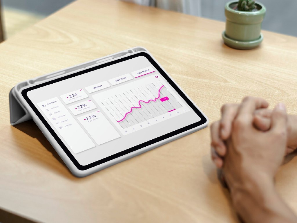
Knowing Your Audience Inside Out
Understanding your audience is like having a guide to their preferences. Use analytics to see where visitors stay or leave. If they abandon checkout, a long form might be the issue; simplify it to just name and payment details. Tools like Google Analytics or Hotjar highlight these problems. Personalization boosts engagement further: if someone browses running shoes, show them similar items or a special offer. A pet store could greet returning visitors with “Welcome Back! See Our Latest Pet Gear.” These touches make users feel valued, increasing their likelihood to convert.
Testing and Refining for Success
Great websites evolve through testing. Small changes can make a big difference. For example, a coffee subscription service might compare two headlines: “Fresh Coffee Delivered Weekly” versus “Your Perfect Brew Awaits.” Tools like Optimizely show which performs better. Try tweaking button colors, layouts, or copy style to match your audience’s preferences. This continuous refinement keeps your site aligned with what drives conversions.
Avoiding Conversion Killers
Mistakes can sabotage your efforts. A cluttered design with too many pop-ups frustrates users, while unclear CTAs leave them directionless. Overlooking mobile users is costly, as most traffic comes from phones; a non-responsive site pushes visitors away. Ignoring data means missing what works, and skipping trust signals can make users hesitant. Keep your site streamlined, mobile-friendly, and backed by data to create an experience that converts.
Conclusion
A high-converting website is more than a digital presence; it’s a tool to turn interest into action. By focusing on clear messaging, trust, strong CTAs, audience insights, and ongoing testing, you can make your site a conversion driver. Whether you’re a startup or an established brand, these strategies will help you connect with visitors and achieve meaningful results.